Whimsey Feline Boarding Brochure Redesign

I don't have a copy of the original brochure, but words cannot describe how poorly designed it was. Seriously my eyes were in physical pain from looking at it. It was most likely created with Microsoft Word (gag). The information was so unorganized and did not flow logically throughout, making it more confusing than it was informative. On top of that, the font they used was almost illegible and the color scheme was so distasteful. I felt like it was a brochure for clown school.
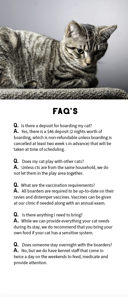
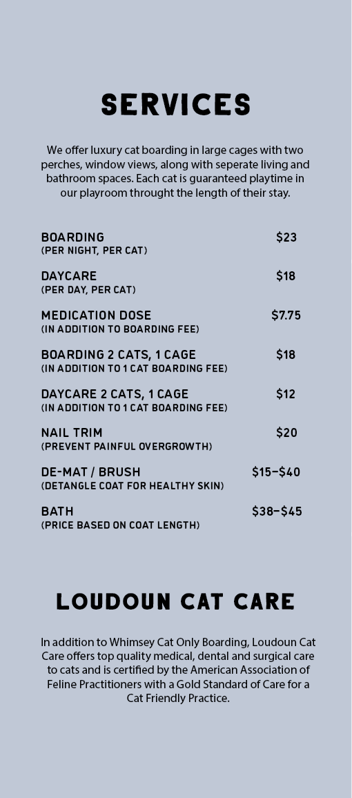
With that being said, I knew that Whimsey Feline Boarding at Loudoun Cat Care was in desperate need of a new collateral piece. I decided on a washed out lavender color scheme with big bold and easy to read type. I chose lavender because it tends to evoke calm and relaxed emotions. Subconsciously, this leads the viewer to believe their precious kitty will be in compassionate hands and well taken care of, allowing them to achieve peace of mind.
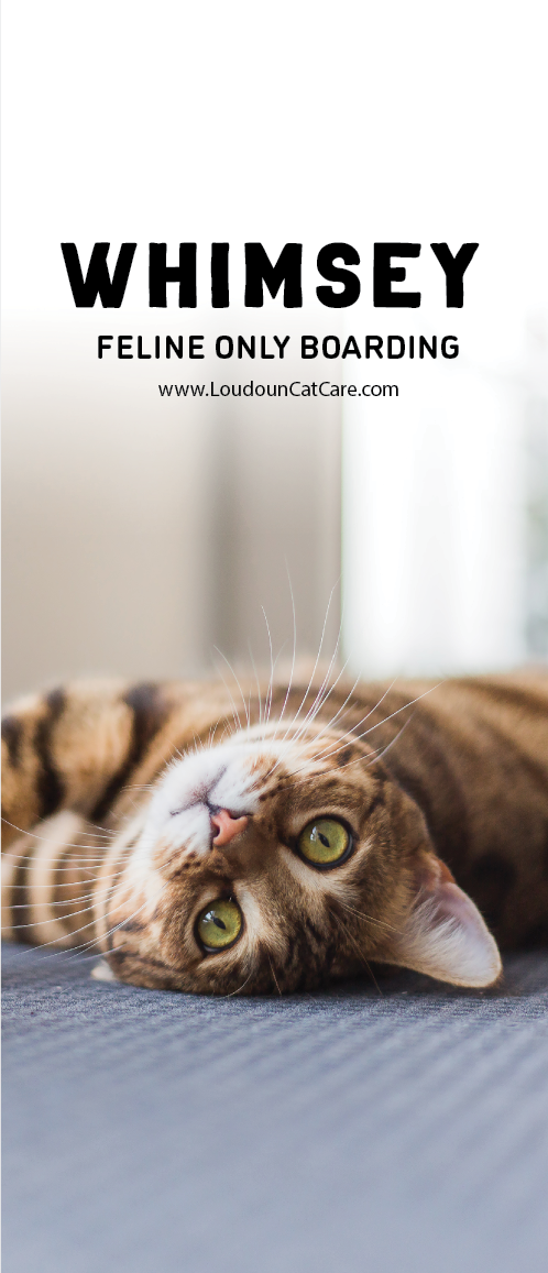
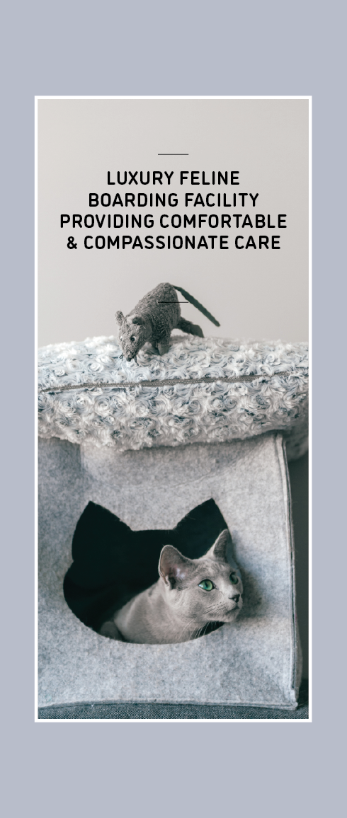
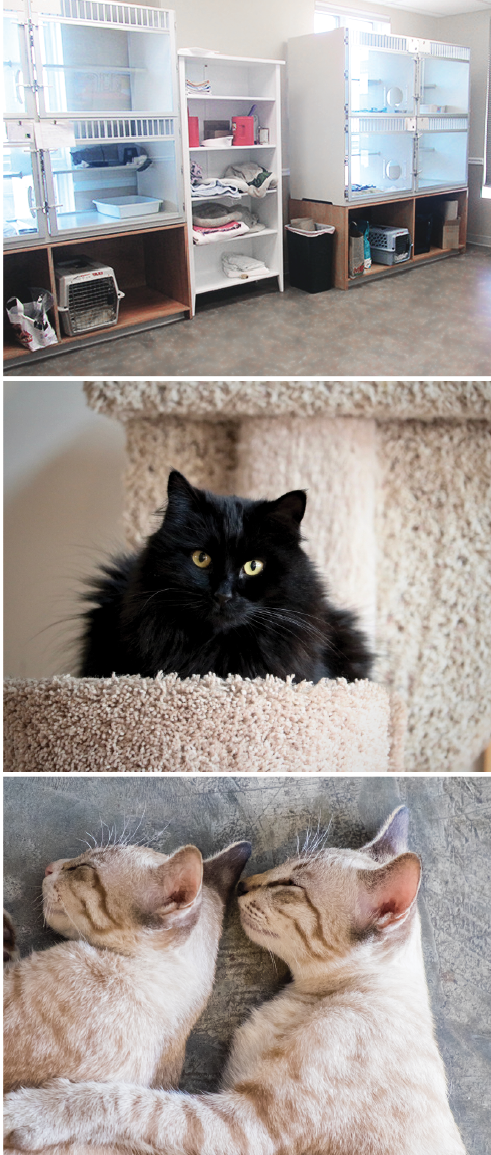
Next, I organized the information in a way that made the most sense to me and simplified the layout. One of the most important changes made was the addition of quality stock photography, which elevates the look and makes it feel more professional. As a consumer, I would 100% pick up this brochure over the original. The attractive images draw you in and peak your curiosity, while the information inside provide answers to your potential questions.
As a business owner, it's important that the print pieces that you offer potential customers and clients are attractive, informative and on-brand with your business. If your collateral is of poor quality, people will think the same of your business.
Are you looking to redesign a collateral piece for your business? Let's chat!
UPDATE!
I found the original brochure and it literally fell into pieces lol so I'm sorry it's all broken up but seriously? This is your marketing piece? Cringing.








コメント